Toolbar replacement in Compose
Before jumping into Toolbar in Jetpack Compose let’s look at what a Toolbar in the traditional View system does.

What is a toolbar?
A Toolbar is a generalization of
action barsfor use within application layouts. While an action bar is traditionally part of anActivity'sopaque window decor controlled by the framework, a Toolbar may be placed at any arbitrary level of nesting within a view hierarchy. An application may choose to designate a Toolbar as the action bar for an Activity using thesetActionBar()method.
A Toolbar typically contains a
- Navigation button: an up arrow for going back to the previous screen or outside the application
- Title/Subtitle: Giving context to the content on the screen. The subtitle is used to give additional context for extended context.
- Action Menu: For quick actions or frequently used actions of the application and an overflow menu for additional actions.
Additionally, the toolbar sometimes contains a branding logo or custom views for additional content.
Top App Bar
In Jetpack Compose we have TopAppBar composable that provides access to key tasks and information. Generally hosts a title, core action items, and certain navigation items.
API
@ExperimentalMaterial3Api
@Composable
fun TopAppBar(
    title: @Composable () -> Unit,
    modifier: Modifier = Modifier,
    navigationIcon: @Composable () -> Unit = {},
    actions: @Composable RowScope.() -> Unit = {},
    windowInsets: WindowInsets = TopAppBarDefaults.windowInsets,
    colors: TopAppBarColors = TopAppBarDefaults.topAppBarColors(),
    scrollBehavior: TopAppBarScrollBehavior? = null
): Unit- title: The text that appears across the app bar.
- modifier: the Modifier to be applied to the this TopAppBar.
- navigationIcon: The primary icon for navigation. Appears on the left of the app bar.
- actions: Icons that provide the user access to key actions. They appear on the right of the app bar.
- windowInsets: a window inset that the app bar would respect.
- colors: Determines how the app bar appears.
- scrollBehavior: Determines how the top app bar responds to the scrolling of the scaffold’s inner content.
Usage
The TopAppBar is contained inside a Scaffold. A Scaffold composable takes in the TopAppBar composable as a parameter and renders the TopAppBar.
Basic
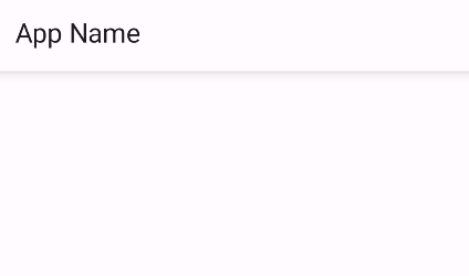
Below is an example of a composable that renders a basic TopAppBar with a title and an elevation of 8dp.
@OptIn(ExperimentalMaterial3Api::class)
@Composable
fun ScreenBasic() {
    Scaffold(topBar = {
        TopAppBar(
            modifier = Modifier.shadow(elevation = 8.dp),
            title = { Text(text = "App Name") },
        )
    }) { innerPadding ->
        // screen content.
    }
}
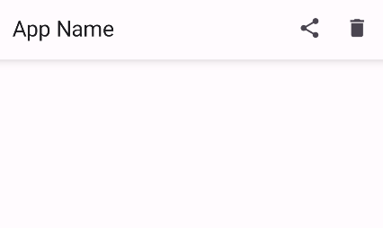
With Actions(or menu items)
@OptIn(ExperimentalMaterial3Api::class)
@Composable
fun ScreenBasic() {
    Scaffold(topBar = {
        TopAppBar(
            modifier = Modifier.shadow(elevation = 8.dp),
            title = { Text(text = "App Name") },
            actions = {
                IconButton(onClick = { TODO("action to be performed on click") }) {
                    Icon(imageVector = Icons.Filled.Share, contentDescription = "Share")
                }
                IconButton(onClick = { TODO("action to be performed on click") }) {
                    Icon(imageVector = Icons.Filled.Delete, contentDescription = "Save")
                }
            }
        )
    }) { innerPadding ->
        // screen content.
    }
}
With Actions and overflow menu
@OptIn(ExperimentalMaterial3Api::class)
@Composable
fun ScreenBasic() {
    var showMenu by remember { mutableStateOf(false) }
    Scaffold(topBar = {
        TopAppBar(
            modifier = Modifier.shadow(elevation = 8.dp),
            title = { Text(text = "App Name") },
            actions = {
                IconButton(onClick = { TODO("action to be performed on click") }) {
                    Icon(imageVector = Icons.Filled.Share, contentDescription = "Share")
                }
                IconButton(onClick = { TODO("action to be performed on click") }) {
                    Icon(imageVector = Icons.Filled.Delete, contentDescription = "Save")
                }
                // over flow menu
                IconButton(onClick = { showMenu = !showMenu }) {
                    Icon(imageVector = Icons.Default.MoreVert, contentDescription = "")
                }
                DropdownMenu(
                    expanded = showMenu,
                    onDismissRequest = { showMenu = false }
                ) {
                    DropdownMenuItem(text = { Text(text = "Menu Item") }, onClick = { /*TODO*/ })
                }
            },
            navigationIcon = {
                IconButton(onClick = { TODO("action to be performed on click") }) {
                    Icon(imageVector = Icons.Filled.ArrowBack, contentDescription = "Back")
                }
            }
        )
    }) { innerPadding ->
        // screen content.
    }
}
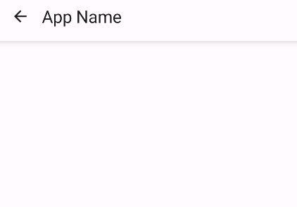
With Navigation Icon
@OptIn(ExperimentalMaterial3Api::class)
@Composable
fun ScreenBasic() {
    Scaffold(topBar = {
        TopAppBar(
            modifier = Modifier.shadow(elevation = 8.dp),
            title = { Text(text = "App Name") },
            navigationIcon = {
                IconButton(onClick = { TODO("action to be performed on click") }) {
                    Icon(imageVector = Icons.Filled.ArrowBack, contentDescription = "Back")
                }
            }
        )
    }) { innerPadding ->
        // screen content
    }
}
Refer to the official documentation for more samples and understanding of TopAppBar in compose.
Happy Composing


